What is a Color Gamut?
- By Robert Roland
- on
- in Foundations

Digital Displays and Color Gamuts: What Are They?
Digital displays are all around us. They’re in our pockets, in our homes, and they’re even in our cars! Something they all have in common is that they all show color; however, none of them show color the same way.
By now, you’re probably wondering what this has to do with making stickers and labels. Well, when we receive your artwork, our computer monitors might display the colors of your artwork a little differently than how your device displays them. This is because different devices, such as computers, tablets, phones, and even printers, all have different color gamuts. This begs the question: How do we get these digital and printed colors to match?

What is a Color Gamut?
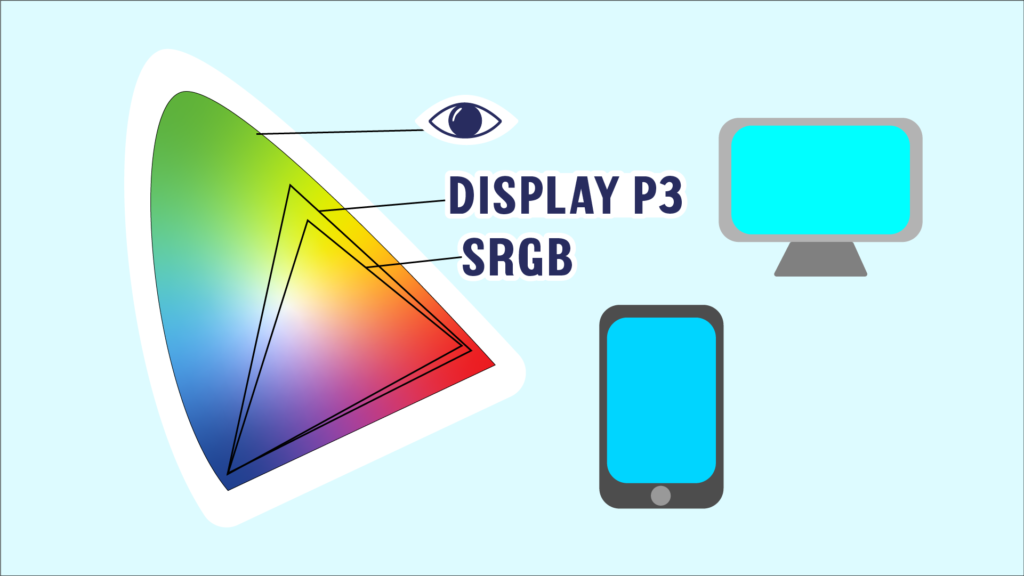
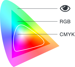
First, let’s take a look at what a color gamut is. A color gamut is the range of colors that a specific device is capable of producing. Digital devices, such as the screen you are using right now, use the RGB color space. This is because it uses light to create colors. R stands for red light, G is green, and B is blue. When these three colors of light are combined, they create white light. However, different devices and displays are only capable of producing a certain percentage of that color space due to the variabilities in each device.

For example, a Mac desktop computer uses the Display P3 color space, which has a slightly larger range of green hues than the standard sRGB color space used in an iPhone. In the world of printing, on the other hand, we encounter many different color spaces that are all used together to print stickers and labels. Our computer screens use different versions of RGB and are calibrated to the lighting in our office. Our digital printers use CMYK, however, we do have the ability to add other inks, such as purple and orange, in order to create a wider gamut and thus more colors. In order to create a seamless workflow, we have various methods that make it easy to keep colors consistent.

What are Color Profiles?
So, what is that workflow? We use color profiles. A color profile is data that characterizes a certain device that can be embedded into images to indicate the range of colors it can produce. This ensures consistency between the digital file and the printed design.
To make it easier for our production crew to match colors, the art team views the files in CMYK, that way we gain a more accurate view of what the final outcome will be. Then the artwork is sent to our printers. Our printers are already set up with standard color profiles that convert between color spaces in order to recreate your design as accurately as possible.
With the press of a button, our Indigo printers know how to create certain colors on different papers. This is so colors remain consistent with each color run you give us.
Quality Check At Every Step
We don’t stop there though. We quality check each order every step of the way. Our art team double-checks colors through proofs. Once it reaches the printers, they test out and compare the proof to the print to make sure the colors match. We go through the whole digital printing process here. Finally, if you ordered a label, we have special rewinders that have cameras that inspect for flaws while they’re counting out the labels per roll. Even then, if anything is amiss, we communicate with each other until we achieve the desired outcome.
The Sticker Mountain Promise
To us, it’s more than just color matching. To us, it’s creating an experience that you can’t get anywhere else. At Sticker Mountain, we go the extra mile to ensure you are getting the proper colors for your brand every time you order. Your time is precious, so we ensure consistency and efficiency so you can keep doing what you do best: running your business.
